- Blog
- 12 Stunning DTC Fashion Popup Examples
12 Stunning DTC Fashion Popup Examples
-
Nikolett Lorincz
- Ecommerce
- 6 min read
Table of Contents
The fashion sector has been a cornerstone of the ecommerce industry for a long time, and it shows no sign of slowing down. 67.7% of DTC brands are in the fashion and apparel market, and the ecommerce fashion industry is expected to hit a $672.71 billion valuation by 2023.
In the fashion industry, it’s essential to deliver personalized messages that capture your visitors’ attention… and popups are one of the best ways to do that.
Whether you’re pushing a special offer, promoting a seasonal sale, or informing your customers about free shipping, popups help you to get your messages across. They’re also a great opportunity to establish and refine your brand identity.
In this article, we’ll show you 12 stunning examples of DTC fashion popups that you can use as inspiration for your own brand.
Let’s get right into it!
1. Christopher Cloos
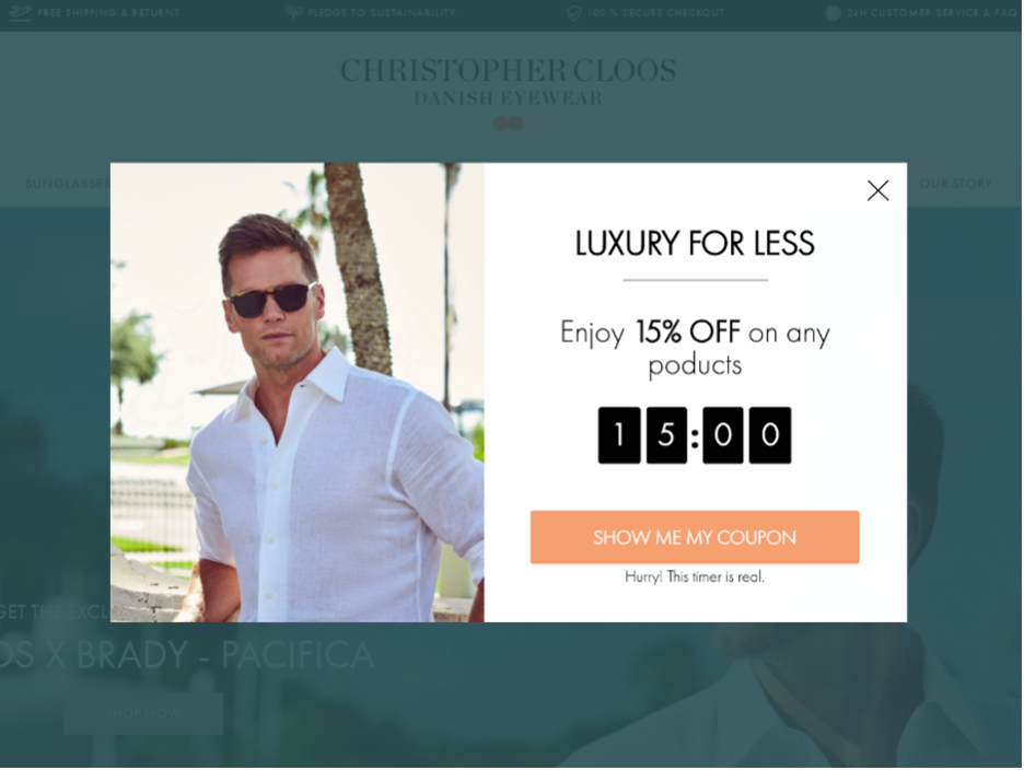
Christopher Cloos has built their brand on selling sunglasses with sleek, classic frames. So it stands to reason that their popup design should also be sleek and simple.
Check out the streamlined design and square corners of the popup below, which match their brand identity perfectly.
They also use a ticking clock element on their popup, which clearly shows that the deal they’re offering only lasts for 15 minutes. This gives the offer a sense of urgency and encourages visitors to buy now rather than later.
2. The Oodie
The Oodie’s brand values revolve around comfort and acceptance. The popup below, with an eye-catching cutout image of someone wearing their flagship product and offering a hug, perfectly reinforces these ideas.
They also offer a clear, easy-to-understand benefit to the consumer: $25 off the next purchase they make.
Another nice touch is the opt-out button, which reads “No, thanks, I’d rather pay full price.” This message helps drive home the value of the offer.

3. Tamara Mellon
Tamara Mellon’s popup uses strong iconography to generate a feeling of power and optimism in the person viewing the popup.
The black high-heel pointing to the offer naturally drives attention toward the $50 off. That makes people want to sign up for their newsletter!

4. DATURA
People say that a picture is worth a thousand words, but sometimes the absence of a picture is worth just as much.
DATURA’s simple, text-only popup impresses precisely because it isn’t trying too hard to impress. It also highlights the value that their newsletter delivers, without any distractions.

5. NAADAM
NAADAM makes a great job at showing their products at the popup. It shows people exactly what they could get with 10% off.
The DTC brand not only asks for an email address, but also a phone number and visitors’ birthday.
Since they want to send text messages to subscribers, it’s important to include a lengthy terms and conditions. Check out how NAADAM designed its popup to convey all that information without looking cluttered or overwhelming.

6. THAKOON
THAKOON’s popup is a great study in contrast, showing how much simple white text on a black background can pop.
The way the photo is placed on the same background as the text really adds to the effect.
Also worth noting: they’re asking for information like first name, last name, and birthday, which will be useful for personalization down the line.

7. CUUP
This popup from CUUP is another great example of how to use a photo and copy to communicate with visitors.
The photograph radiates comfort and ease, which is exactly what CUUP says their bras feel like.
The popup informs visitors that they don’t ship to their country (yet!) and asks for some information, so they can notify them as they expand internationally.

8. Dear Frances
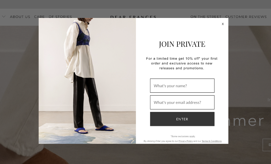
This Dear Frances email popup radiates class and high fashion. The muted colors and simple background give the impression of a brand that isn’t trying too hard to show off.
This effect works all the better since they’re asking customers to join a “private” club. When your visitors feel like they have the opportunity to gain access to an exclusive club, they’re more motivated to sign up.
9. MIRTA
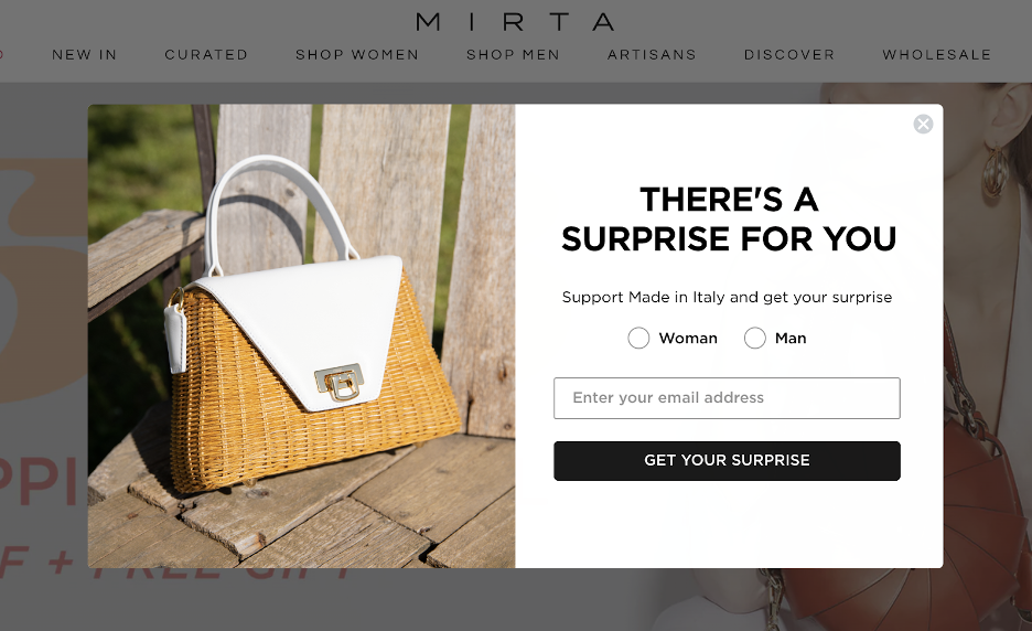
MIRTA kept the design of their popup simple, but the great copy is where it really shines. By promising their visitors a surprise, they’re generating a sense of curiosity about what it will be.
Sometimes a bit of mystery can lead to a more successful campaign than even a big discount!
10. Linjer
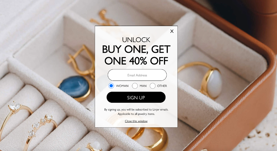
Linjer’s popup puts the focus on their “Buy one, get one 40% off” deal. Since they’re offering so much value to their customers, it makes sense to really highlight it, which they do effectively with the big, bold text.
As we’ve seen in some other popups, they make it easy to sign up for their email list by requiring very little information. All you have to do is enter your email address and gender, and then you get the deal.
11. DeMellier
This popup from DeMellier is intended to introduce new visitors to their ecommerce store. And it does a great job conveying vital information to the visitor.
After welcoming visitors and promising a 10% discount on first orders, DeMellier goes on to highlight that they offer free shipping and returns as well as duty-free products. These two pieces of information help customers better understand what the brand has to offer.

12. Senreve
Senreve’s call to action, “Let’s Connect,” works well to encourage new customers to build a genuine connection to the brand. You can tell that Senreve is thinking about each customer’s lifetime value, rather than just making a one-off sale.
The benefits they list also reinforce the idea that they care about the individual who is seeing the popup, promising exclusive access to sales and early access to new products.

How to create your own fashion popup?
Ready to launch a stylish, high-converting popup? Here’s how to create your own fashion popup with OptiMonk in just a few simple steps.
Step 1: Pick a template
Start by choosing from our library of 300+ professionally designed templates, tailored for all kinds of goals—from lead capture to sales promotions.
Each template is fully customizable in our no-code, drag-and-drop editor, so it’s easy to match your brand’s unique look.
Step 2: Customize your design
Once you’ve selected your base, it’s time to make it yours. Adjust the text, visuals, and layout to suit your brand. With just a few clicks, you can create a stunning popup that looks and feels like a natural part of your website.

Step 3: Set smart triggers & targeting
Don’t show your popup to everyone at random. Set smart triggers—like exit intent or scroll depth—and target specific segments such as new or returning visitors.
This way, your message appears at the right moment in the customer journey, creating a smooth experience instead of an interruption.

Step 4: Launch & optimize
Once you’re happy with the setup, hit publish and go live. Then keep an eye on your campaign’s performance in OptiMonk’s analytics. Use the data to fine-tune and improve results over time—it’s all part of the process.
FAQ
What makes a fashion popup “stunning”?
A stunning popup grabs attention without disrupting the shopping experience. Think bold visuals, on-brand messaging, smooth animations, and smart targeting. The best ones feel like a natural part of the brand.
Why should DTC fashion brands use popups?
Popups are one of the most effective tools for growing email lists, reducing cart abandonment, and promoting time-sensitive offers—especially in the fast-moving fashion space.
How often should I show a popup to the same visitor?
Less is more. Use frequency caps to avoid popup fatigue—1 to 2 views per session is usually enough. Make every interaction feel intentional, not intrusive.
Recap
Any good marketer will tell you that keeping your messages consistent is incredibly important. That principle is doubly important for on-site messaging. All the fashion popups we’ve seen match the look, feel, and ideas of the brands that created them.
Migration has never been easier
We made switching a no-brainer with our free, white-glove onboarding service so you can get started in the blink of an eye.
What should you do next?
Thanks for reading till the end. Here are 4 ways we can help you grow your business:
Boost conversions with proven use cases
Explore our Use Case Library, filled with actionable personalization examples and step-by-step guides to unlock your website's full potential. Check out Use Case Library
Create a free OptiMonk account
Create a free OptiMonk account and easily get started with popups and conversion rate optimization. Get OptiMonk free
Get advice from a CRO expert
Schedule a personalized discovery call with one of our experts to explore how OptiMonk can help you grow your business. Book a demo
Join our weekly newsletter
Real CRO insights & marketing tips. No fluff. Straight to your inbox. Subscribe now
Nikolett Lorincz
- Posted in
- Ecommerce
Partner with us
- © OptiMonk. All rights reserved!
- Terms of Use
- Privacy Policy
- Cookie Policy
Product updates: January Release 2025
